Data Visualization ggplot2 (Part 1)
Introduction
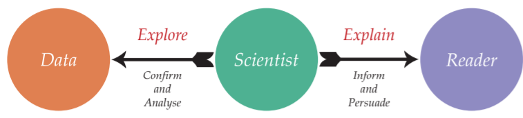
It is very important to note the differences between data exploration and explanation
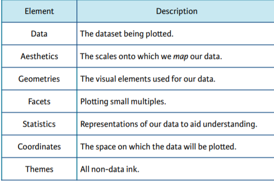
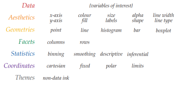
- Grammar of Graphics. Graphics are built upon an underlying grammar. The Grammar of Graphics is a plotting framework.
- There are 2 principles
- Graphics are made up of distinct layers of grammatical elements.
- Meaningful plots are built around appropiate aesthetic mappings
- We have a total 7 grammatical elements
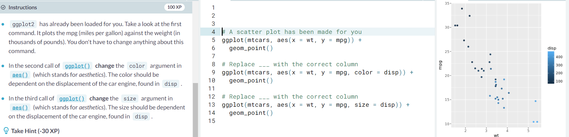
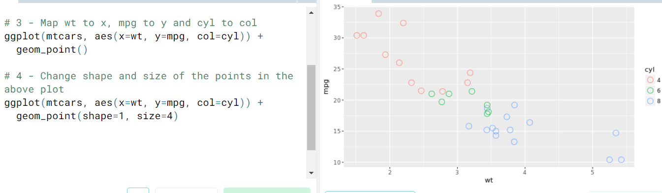
- Example. Let's look at the following commands which produce a geometry dependent on an extra variable
- There are 2 principles
- Exploring ggplot. Let's vissually understand what each layer does inside Grammar of Graphics.
- Data. We build a plot based on data
- Aesthetics.
- Geometries.
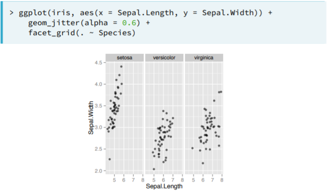
- Facets
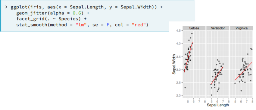
- Statistics
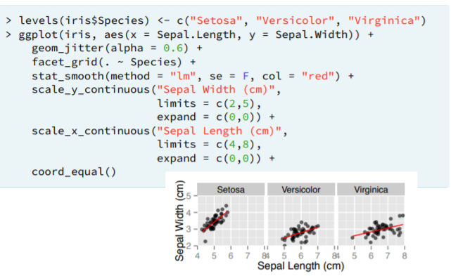
- Coordinates
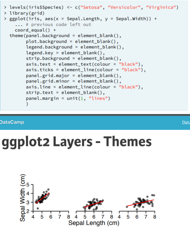
- Theme
- Ex.
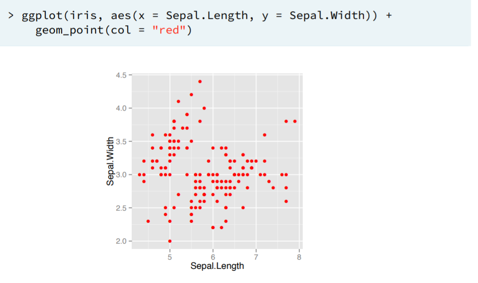
- Using geom_point() y geom_smooth() is a common combination, this tells R to plot points or a smooth line following the given data.
- Using geom_point() y geom_smooth() is a common combination, this tells R to plot points or a smooth line following the given data.
- Data. We build a plot based on data
- Understanding the Grammar. Notice how you can store the plot as a
ggplotobject that you can use later on to add other layers- Here you'll explore mixing arguments and aesthetics in a single geometry.
- Here you'll explore mixing arguments and aesthetics in a single geometry.
Data
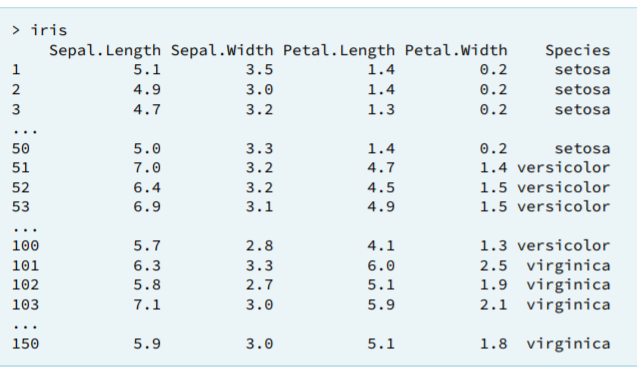
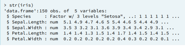
The structure of your data will dictate how you construct plots in ggplot2. Or you could think it the other way around: depending on how you want your plot there are more convenient ways of data formats.
- Objects and layers
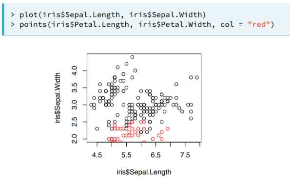
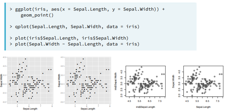
- Proper Data Format. We originally have 2 pairs of variables that we want to plot against each other in the same plot.
- In Base R we perform something like this, based on the given data format of iris.
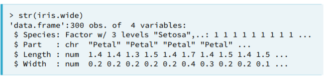
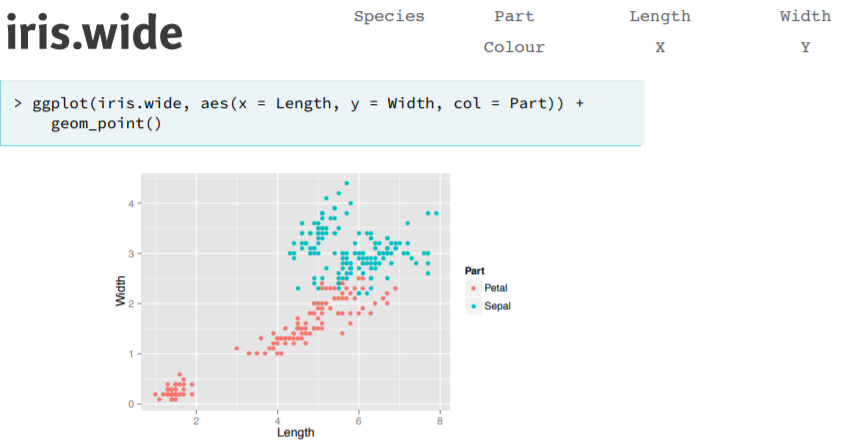
- In ggplot2 we would need to have the data in the proper format; in this case, something like
- In Base R we perform something like this, based on the given data format of iris.
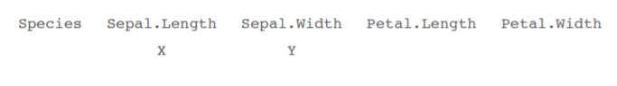
- Tidy Data.
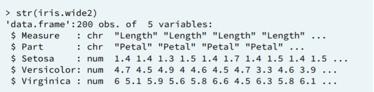
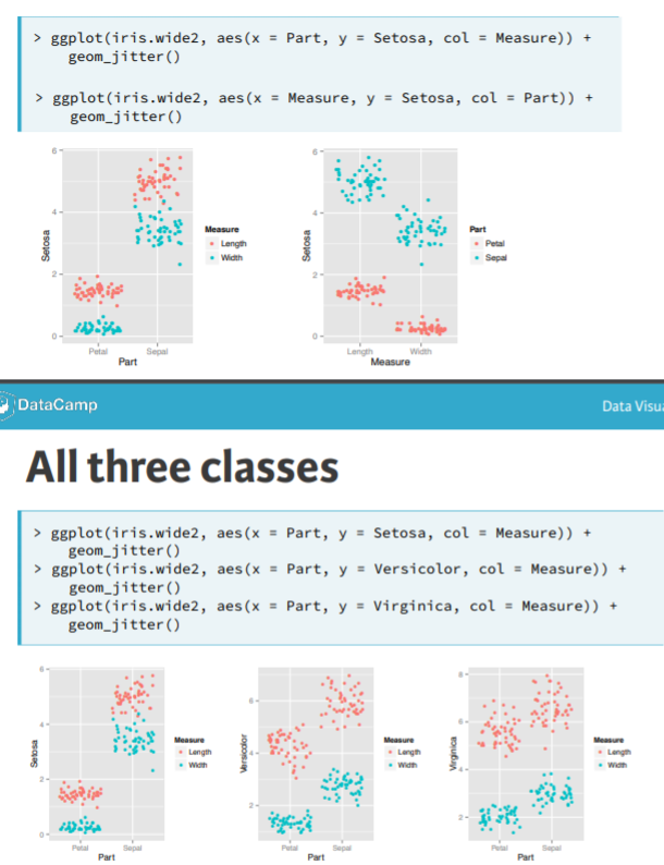
- Consider the possibility of having 3 variables representing the different species
- Then to compare Petal/Sepal measure for each species we would have to do something like:
- Ex. Transform to a different data format
- Consider the possibility of having 3 variables representing the different species
- Remarks
- Ggplots always want "one measurement" (which can mean different things) per row of the data frame.
- A dataset is called tidy when every row is an observation and every column is a variable.
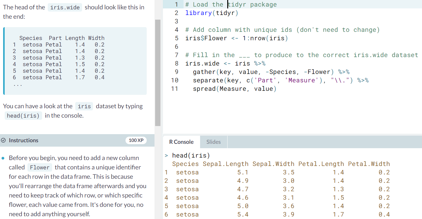
- library(tidyr)
- The
gather()function moves information from the columns to the rows. It takes multiple columns and gathers them into a single column by adding rows. You usegather()when you notice that you have columns that are not variables. - The
separate()function splits one column into two or more columns according to a pattern you define. spread()to distribute the newMeasurecolumn and associatedvaluecolumn into two columns.- The
%>%(or "pipe") operator passes the result of the left-hand side as the first argument of the function on the right-hand side.
- The
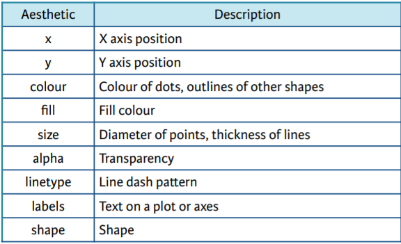
Aesthetics
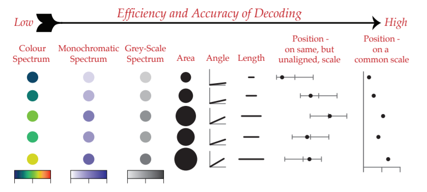
Aesthetic mappings are the cornerstone of the grammar of graphics plotting concept. This is where the magic happens - converting continuous and categorical data into visual scales that provide access to a large amount of information in a very short time.
- Visible Aesthetics. Aesthetics does not refer to how something looks, but rather to which variable is mapped onto it. An Attribute is how something looks, for example, its color, size, shape.
- Attribute. They are declared in geom_().
- If an aesthetic and an attribute are set with the same argument (e.g color), the attribute takes precedence. In this case both aesthetic and attribute are seen thanks to the use of fill, color and shape=23.
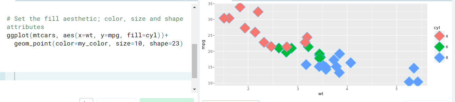
- Ex. (Attribute aassembling)
- If an aesthetic and an attribute are set with the same argument (e.g color), the attribute takes precedence. In this case both aesthetic and attribute are seen thanks to the use of fill, color and shape=23.
- Aesthetics. They are declared in aes(). This command is usually inside de ggplot() definition; but it could be inside geom_() if there are mulltiple data sources.
- Typical Aesthetics
- Ex. (Simple use of aesthetics (inside aes()) and attributes (inside geom_()))
- Ex. (Two aesthetics to a dot). A really nice alternative is
shape = 21which allows you to use bothfillfor the inside andcolfor the outline! This is a great little trick for when you want to map two aesthetics to a dot.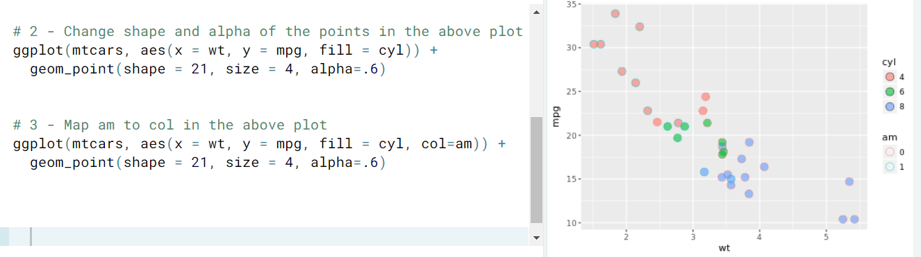
- Remark. Shapes in R can have a value from 1-25. Shapes 1-20 can only accept a
coloraesthetic, but shapes 21-25 have both acolorand afillaesthetic.
- Remark. Shapes in R can have a value from 1-25. Shapes 1-20 can only accept a
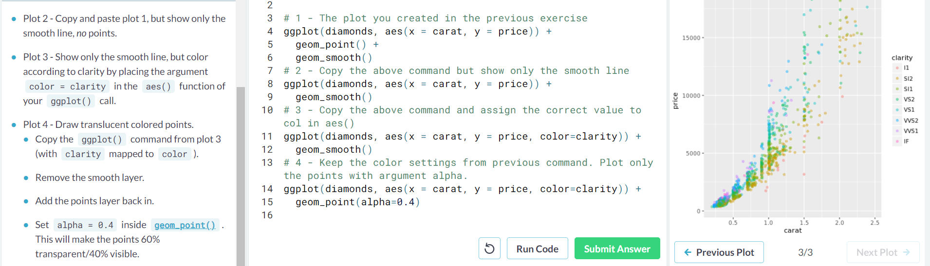
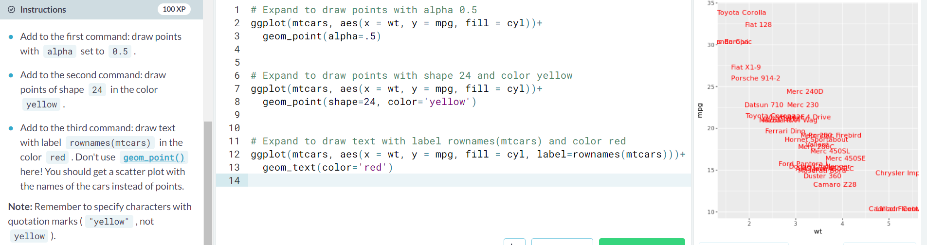
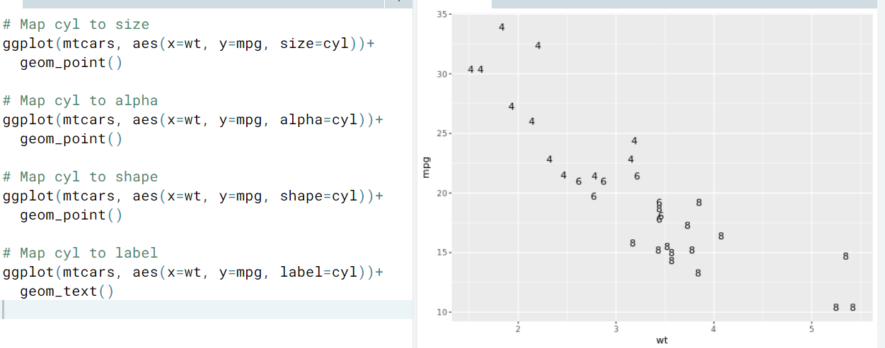
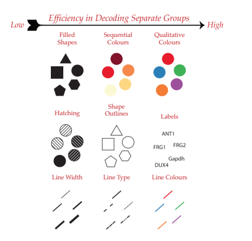
- Ex. (Mapping a categorical variable on size, alpha, shape, label)
- Ex. (Adding multiple aesthetics)
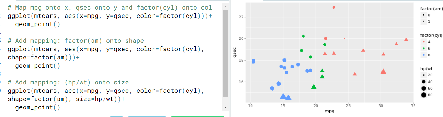
- Remark.
- Notice that adding more aesthetics to your plot is not always a good idea. Adding aesthetic mappings to a plot will increase its complexity, and thus decrease its readability.
labelandshapeare only applicable to categorical data.
- Attribute. They are declared in geom_().
- Modifying Aesthetics
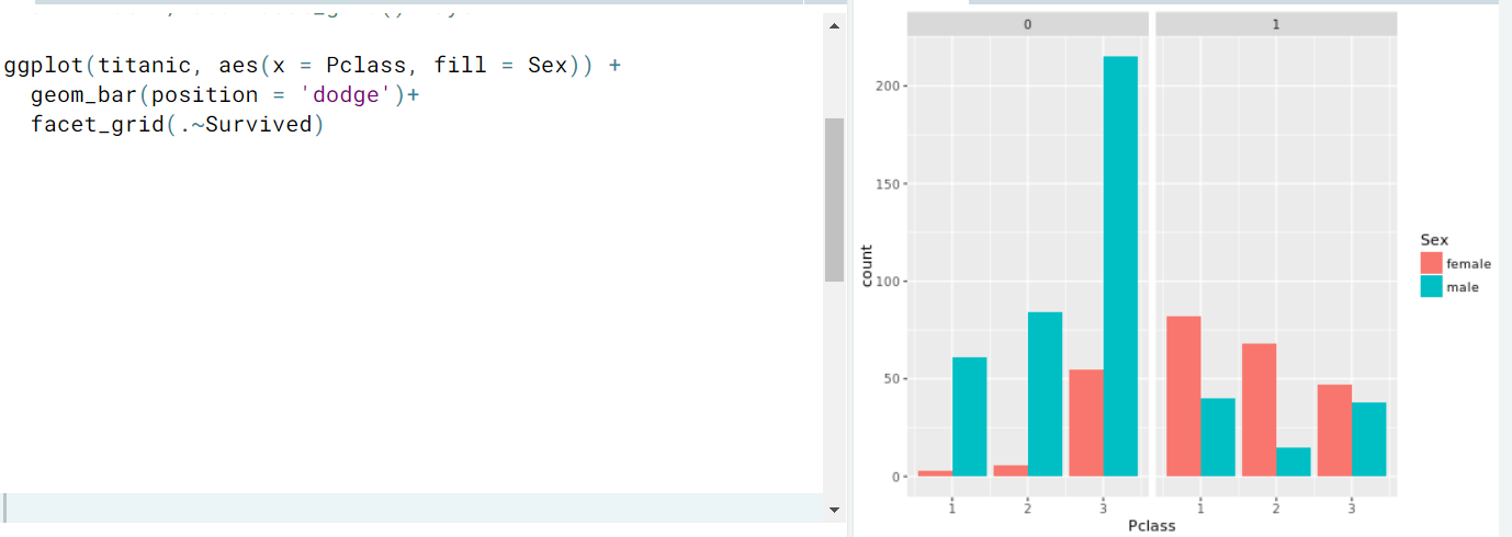
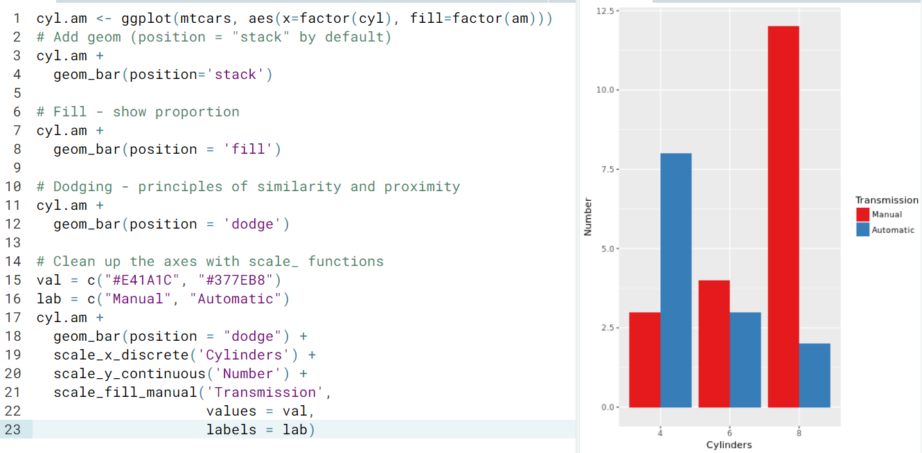
- Position. Specifies how ggplot will adjust for overlapping bars or points in a single layer. There are mainly 7: identity, dodge, stack, fill, jitter, jitterdodge.
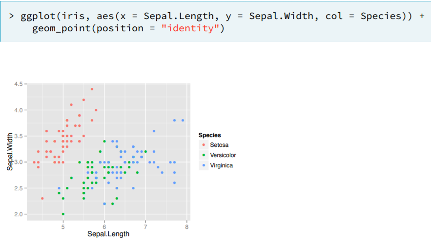
- Identity. (Default)Means that the value in the data frame is exactly where the value will be positioned in the plot
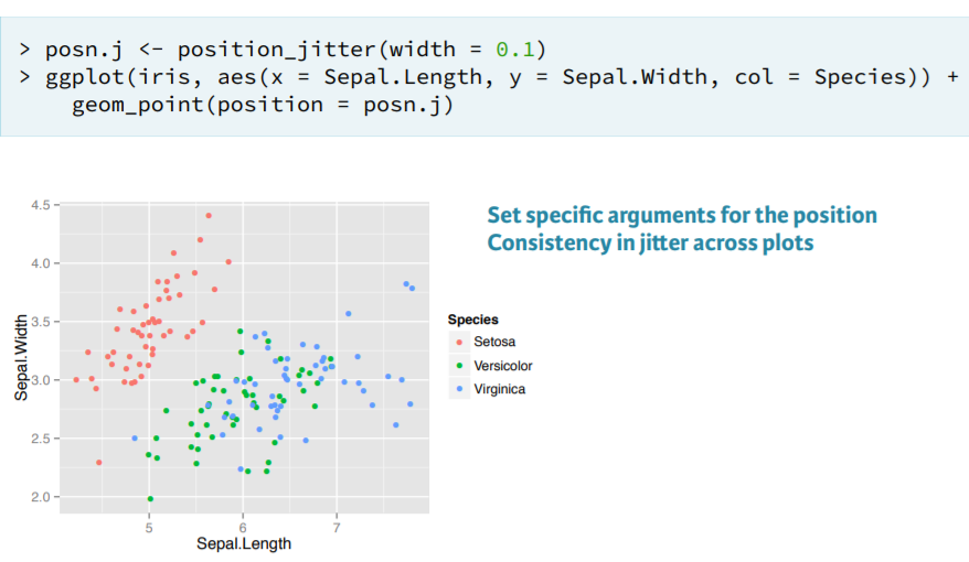
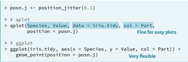
- Jitter. For overplotting; inserts noise in the x, y axis. A common way to specify a Position is to call a function as shown below
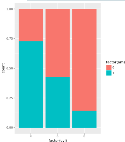
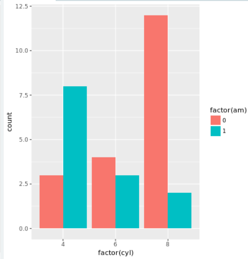
- Ex. (stack, fill, dodge) In that order:
- Identity. (Default)Means that the value in the data frame is exactly where the value will be positioned in the plot
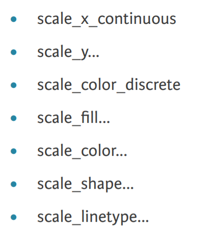
- Scale function. Recall that each of the aesthetics is a scale which we mapped data onto (like color, x, y). We can access the scale with the scale_ functions. The 2nd part defines which scale we want to modify and the 3rd matches the type of data we are using.
- For each of these, we can specify arguments to modify it, e.g limits, breaks, exapnd, labels.
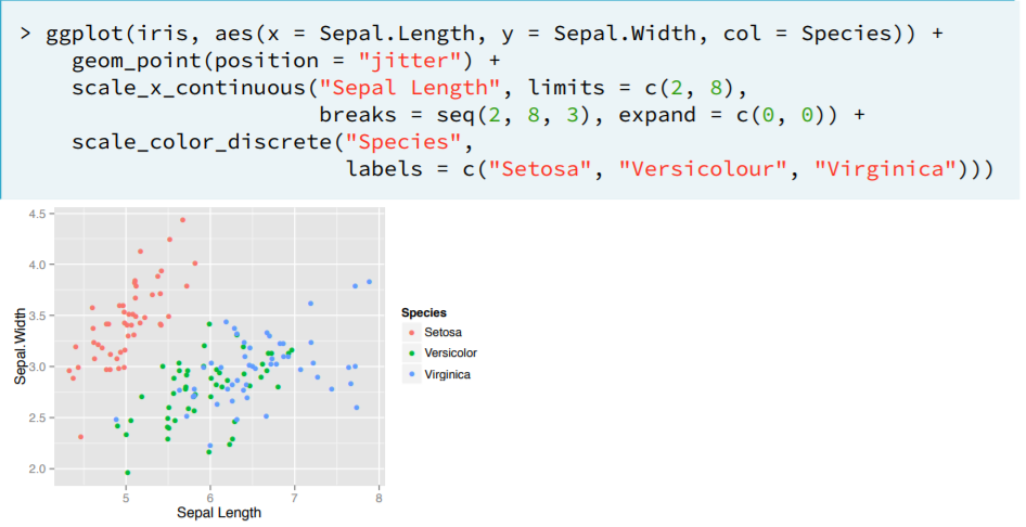
- Remark. If we just want to quickly change the axis labels, we can do this with the labs function.
labs(x='sepal length', y='sepal width', col='species')
- For each of these, we can specify arguments to modify it, e.g limits, breaks, exapnd, labels.
- Position. Specifies how ggplot will adjust for overlapping bars or points in a single layer. There are mainly 7: identity, dodge, stack, fill, jitter, jitterdodge.
- Best Practices. There are more practical ways to present your data into graphics, depending on each case. In general:
- Continuous variables.
- Discrete variables
- Ex. (Overplotting)
- Continuous variables.
Geometries
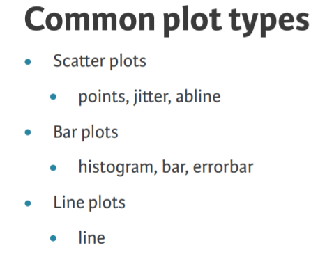
A plot’s geometry dictates what visual elements will be used. We will see the geometries used in the three most common plot types you’ll encounter - scatter plots, bar charts and line plots.
There are currently 37 geometries to choose from , so the question arises: what's the best tool for the job? As communication is essential for our plot, there are some useful guidelines that we'll explore throughout the data vis courses. In addition, each geom is associated with specific aesthetic mappings, some of which are essential
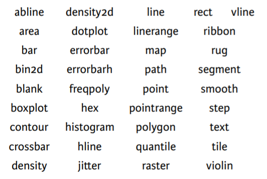 |  |
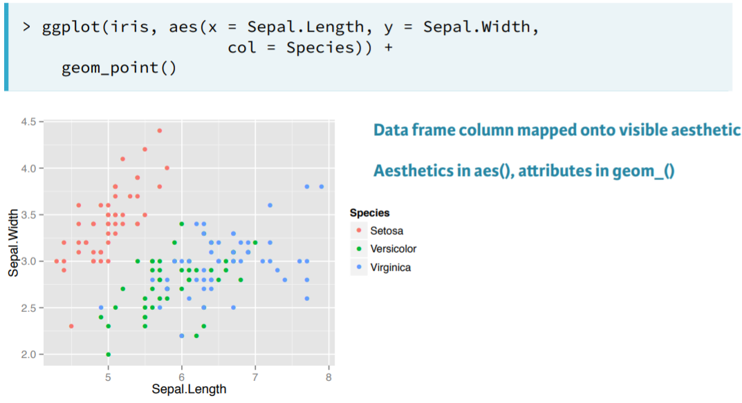
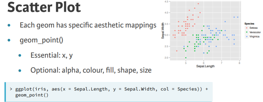
- Scatterplots. We've already produced some of these using the geom_point
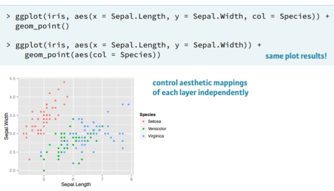
- Remark. A very convenient feature of ggplot is the ability to specify the aesthetics for a given geom inside the geom function. The reason it is useful is because we could add multiple geom layers on top of each other and specify for each one such aesthetics.
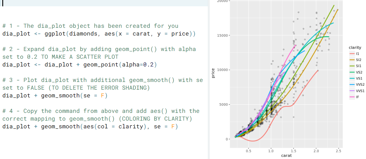
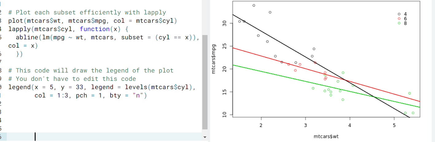
- Add Layers. We can add multiple geom layers, maybe even from different data sources. Geom layers inherits data and aes from ggplot() and different data inherits aes. As shown here
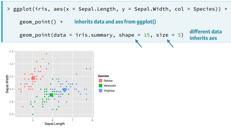
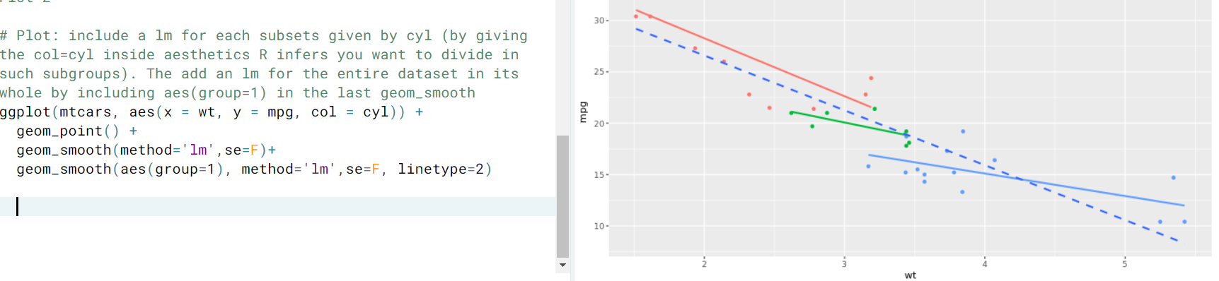
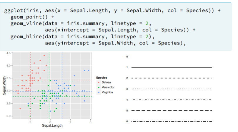
- Crosshairs. These mark where each mean value appears on the plot, but the x and y aesthetics are not inherited, we have to specify a new aesthetic that is specific to this geom, the x'-intercept.
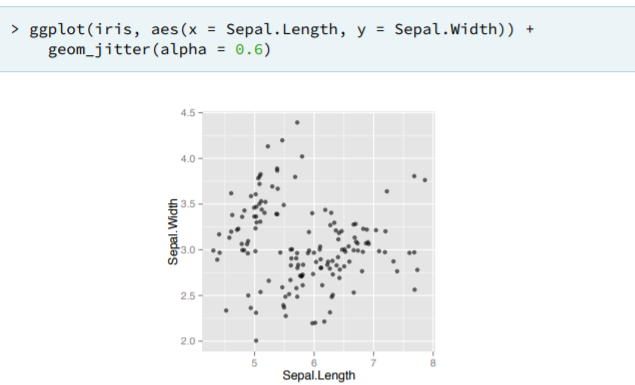
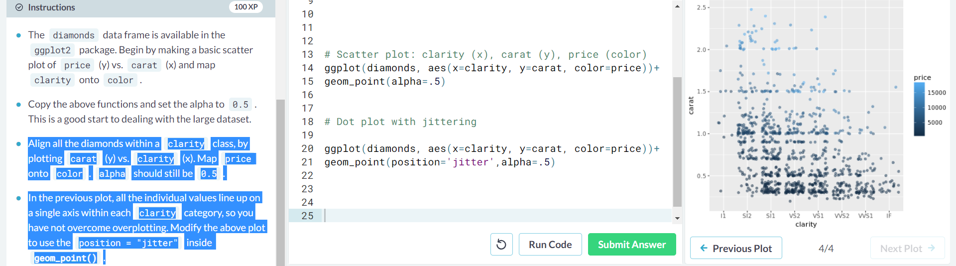
- Jitter. This geom is equivalent to geom_point with the position argument set to "jitter"
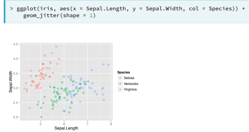
- Notice that
jittercan be 1) an argument ingeom_point(position = 'jitter'), 2) a geom itself,geom_jitter(), or 3) a position function,position_jitter(0.1) - Notice how jittering and alpha blending serves as a great solution to the overplotting problem in some situations.
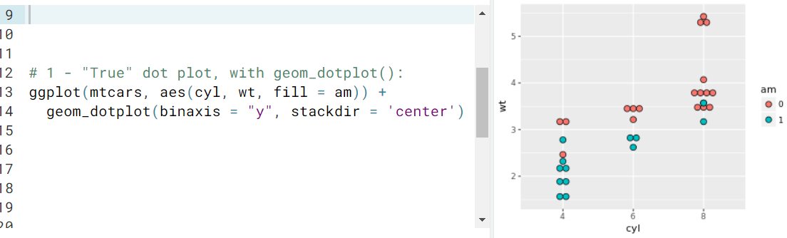
- Ex. geom_dotplot()
- Notice that
- Remark. A very convenient feature of ggplot is the ability to specify the aesthetics for a given geom inside the geom function. The reason it is useful is because we could add multiple geom layers on top of each other and specify for each one such aesthetics.
- Bar plots. The three most common bar plots are histogram, bar and errorbar.
- Histogram. It shows the binned distribution of a continuous variable. They are a specialized version of a barplot. We only need to specify the continuous variable of interest. We can then change the bin width specifying the 'binwidth=x' argument.
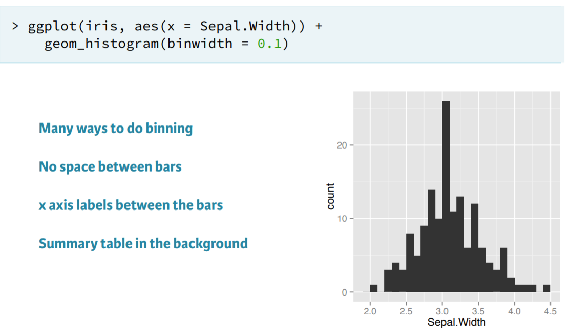
- Remark. Recall that histograms cut up a continuous variable into discrete bins - that's what the stat "bin" is doing. When
geom_histogram()executed the binning statistic (see above), it not only cut up the data into discrete bins, but it also counted how many values are in each bin.
- Remark. Recall that histograms cut up a continuous variable into discrete bins - that's what the stat "bin" is doing. When
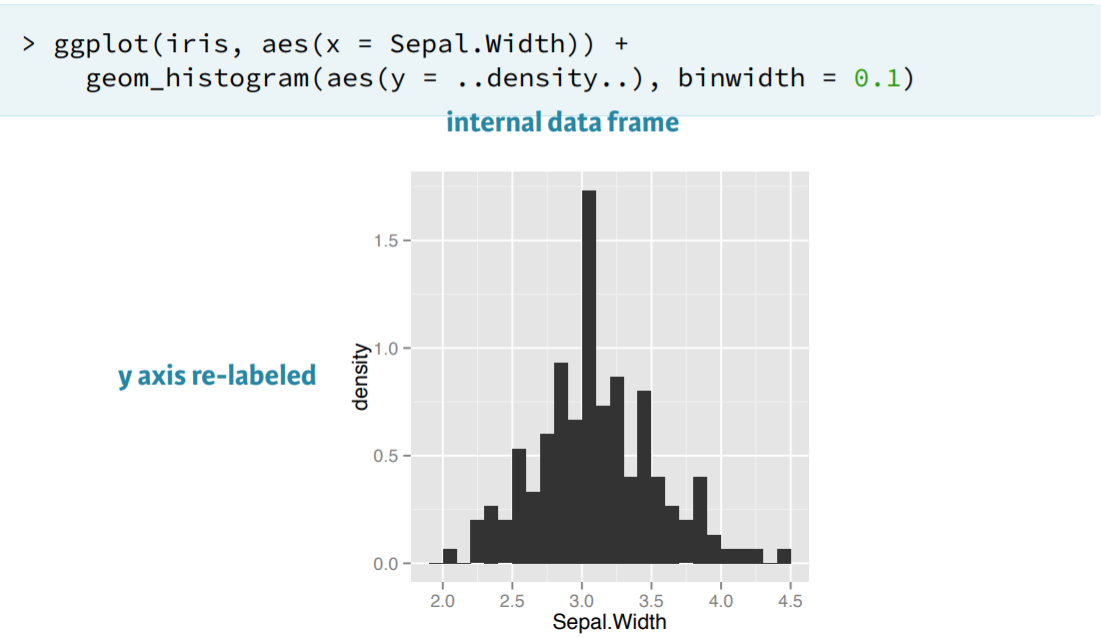
- We can also obtain the density plot, which has already been calculated internally by gg plot. We just specify the aes(y=..density..) argument.
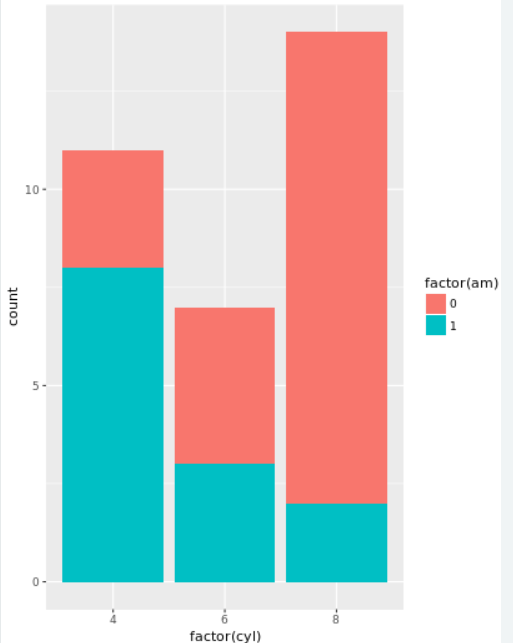
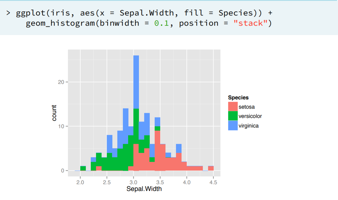
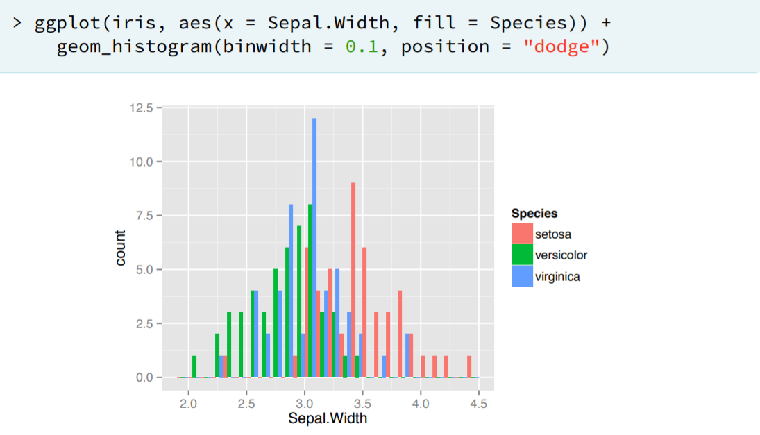
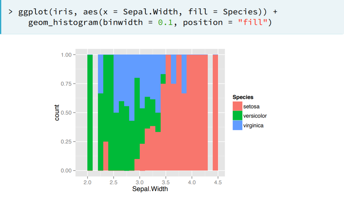
- We can add another aesthetic regarding the different species, like 'fill', and then change the attribute to 'stack', 'dodge', 'fill' as we please.
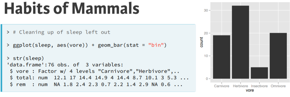
- Bar Plot. We use geom_bar(). All positions from before are available. We can have absolute counts or distributions.
- Absolute counts. In this example using geom_bar by default is set the argument 'stat='bin''.
- Distributions. We can also set the 'stat' argument to identity so that the geom_bar function will not try to insert bins onto y, we want it just as it is.
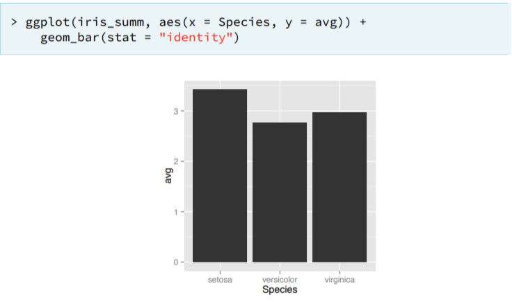
- Absolute counts. In this example using geom_bar by default is set the argument 'stat='bin''.
- Error bar. We use geom_errorbar.
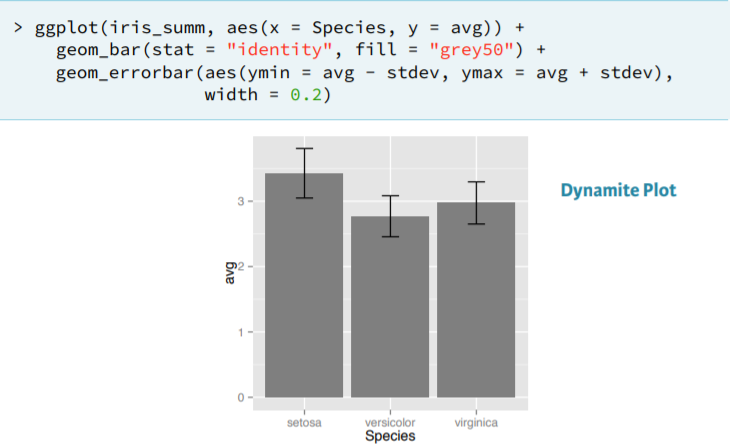
- It is called a dynamite plot and is not really recomendable to use.
- Frequency polygon. This is a geom specific to binned data that draws a line connecting the value of each bin. Like
geom_histogram(), it takes abinwidthargument and by defaultstat = "bin"andposition = "identity".- Ex.
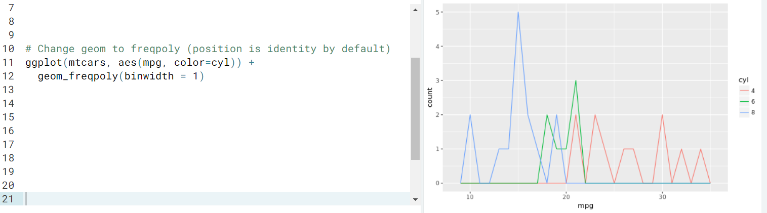
- Remark. Overlapping histograms pose similar problems to overlapping bar plots, but there is a unique solution here: a frequency polygon. The last example is readable while if triyng to present the same data on histograms would not be readable.
- Ex.
- Examples.
- Make a filled bar chart with the
Vocabdataset. Mapeducationtoxandvocabularytofill.Insidegeom_bar(), make sure to setposition = "fill". Allow color brewer to choose a default color palette by using the appropriate scale function, without arguments. Notice how this generates a warning message and an incomplete plot.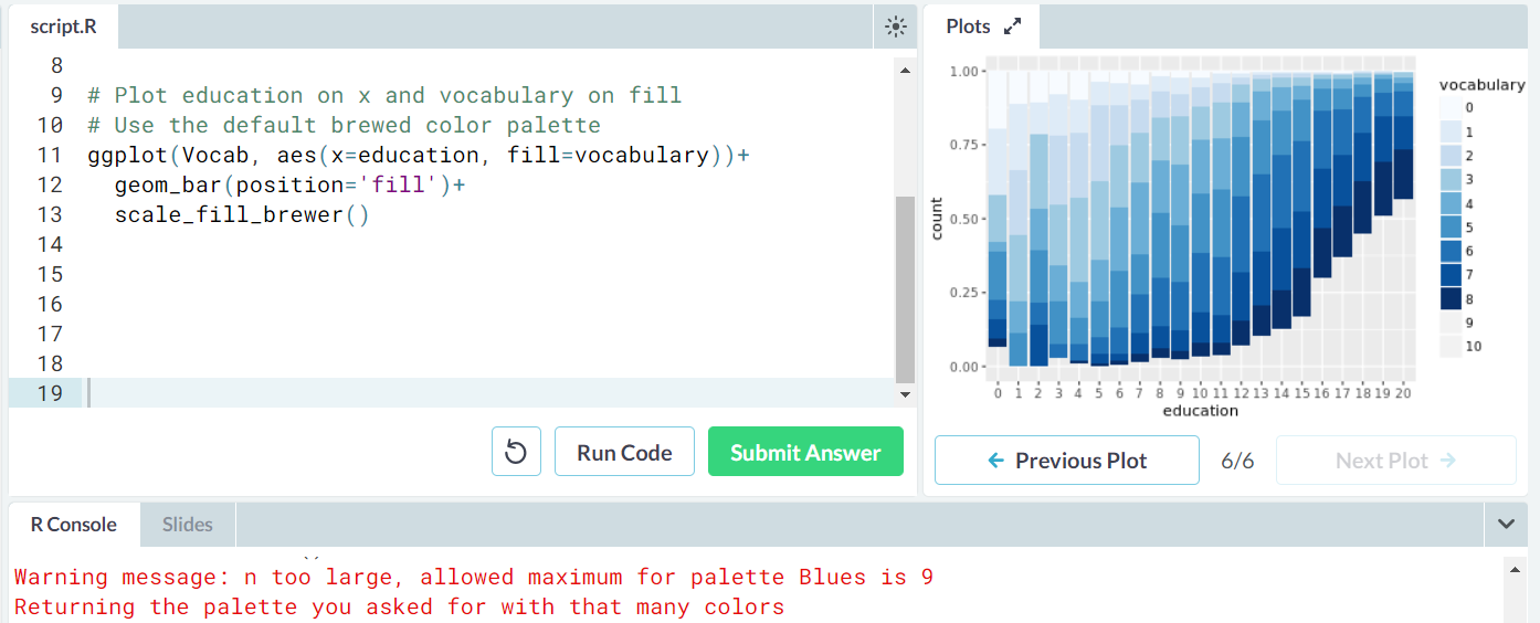
- You can set the color palette used to fill the bars with
scale_fill_brewer(). For a full list of possible color sets, have a look at?brewer.pal.
- You can set the color palette used to fill the bars with
- You'll manually create a color palette that can generate all the colours you need. To do this you'll use a function called
colorRampPalette(). The input is a character vector of 2 or more colour values. The output is itself a function that takes one argument: the number of colours you want to extrapolate.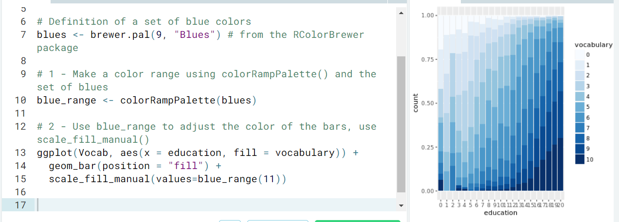
- Make a filled bar chart with the
- Histogram. It shows the binned distribution of a continuous variable. They are a specialized version of a barplot. We only need to specify the continuous variable of interest. We can then change the bin width specifying the 'binwidth=x' argument.
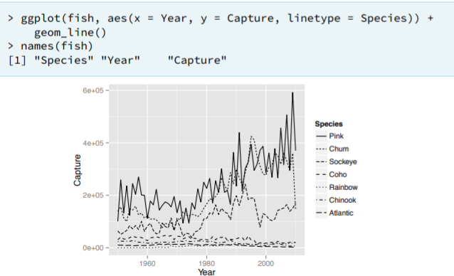
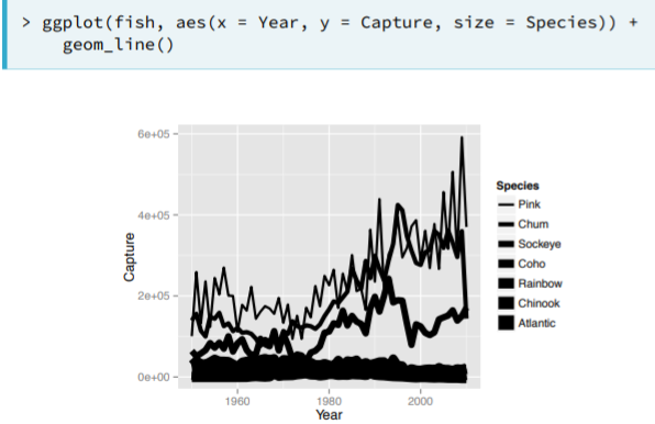
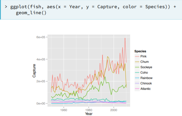
- Line Plots - Time Series
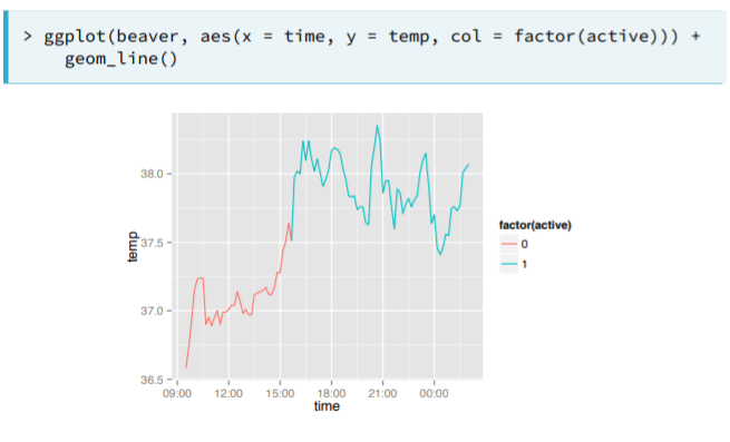
- Single Time Series.
- Multiple Time Series.
- Visualizing Overlapping Series
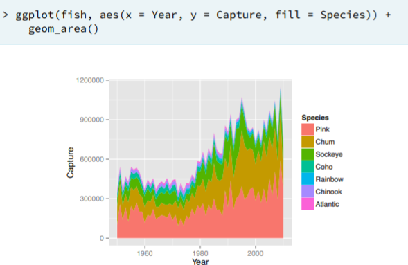
- Analyze the proportion between each species for each year.
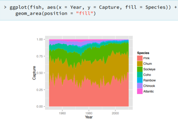
- Overlapping Area Plots
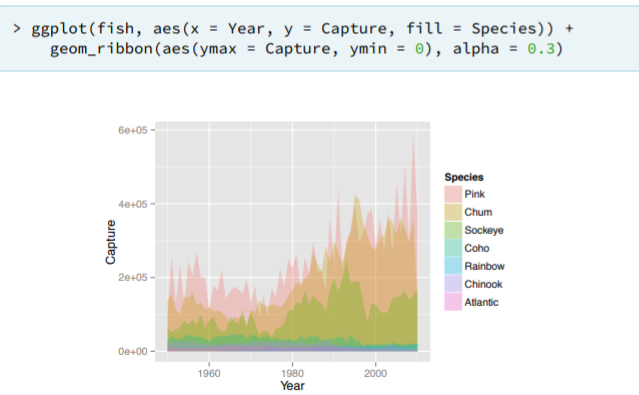
- Visualizing Overlapping Series
- Examples.
geom_rect(). You will use this geom layer to draw rectangles across the recession periods.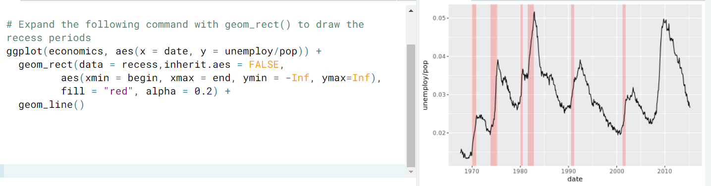
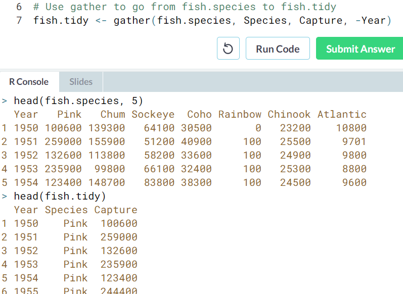
- Convert to tidy data
- Single Time Series.
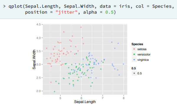
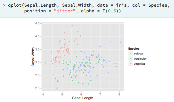
qplot and wrap up
qplot is for easy, quick & dirty plots in the ggplot2 package.
 |  |
- geom and position argument. For the jitter geom we could specify the funcion as we previously saw.
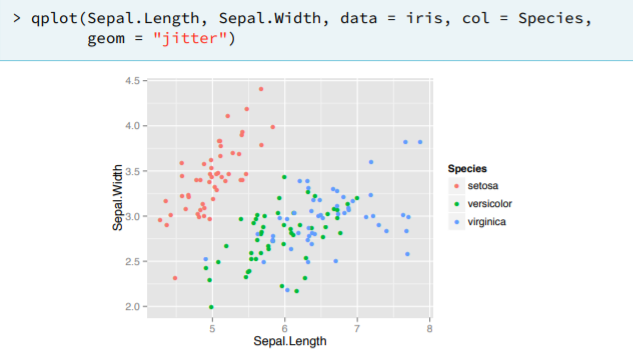
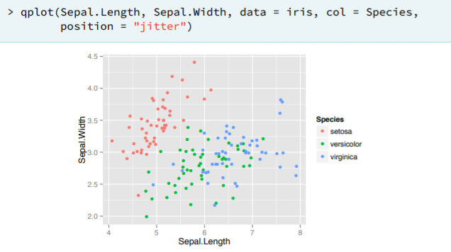
- Remark. qplot does not deal in a good way the use of numerical alrguments.
Examples
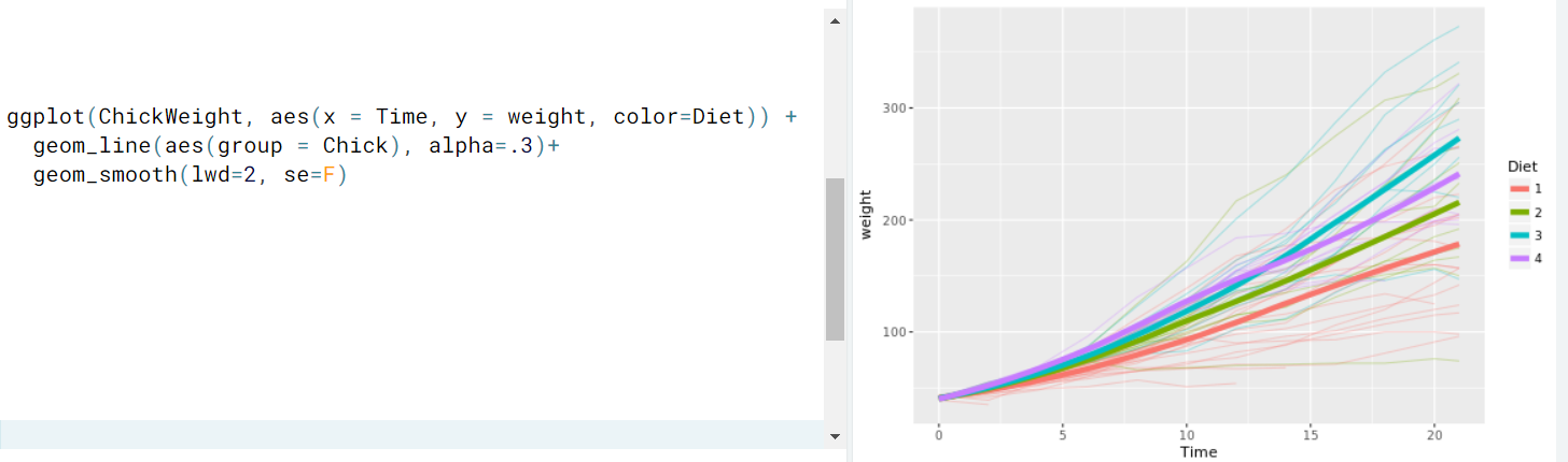
- For each chicken a different diet was provided during a period of time and we want to select the one that gives the highest weight.